moon mother botanicals
illustration, packaging
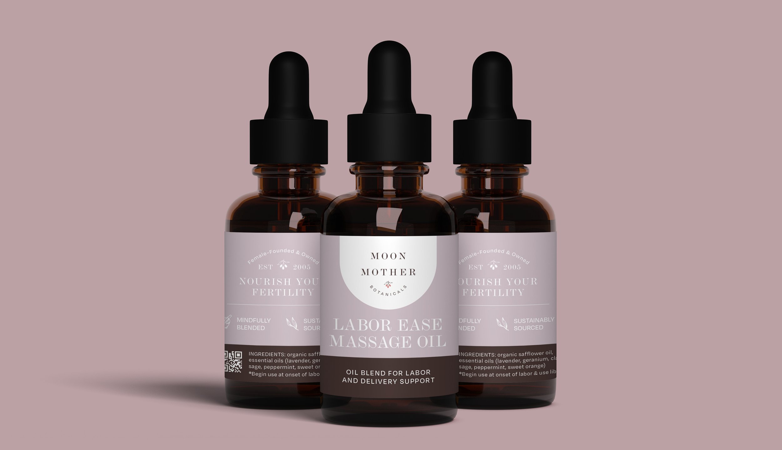
A modern and feminine-centered brand redesign for an existing herbal teas and oils wellness company focused on fertility and childbirth, including packaging for a range of products.
Art Director
Rachel Zorel, 7 Layer Studio
Design Lead
Caitlin Kachmar, 7 Layer Studio

Moon Mother Botanicals, first founded in 2016, was in need of a modern refresh of their existing brand. After careful consideration, we moved toward a natural, soft color palette and developed an icon system that paired well with a minimalist approach to their packaging.
Keeping their packaging straightforward allowed for the focus to stay on the multi-step instructions that come with every product.
PROJECT BRIEF
Moon Mother Botanicals had an established line of offered products when they contacted us for a full rebranding.
We used the new palette to create a color coded system to differentiate their long product list by use, from teas to tinctures and everything in-between.
Packaging Line and Color System
Just a few of the illustrative components created for packaging and digital use.


